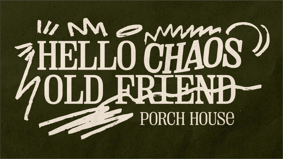
Chaos’s Best Friend
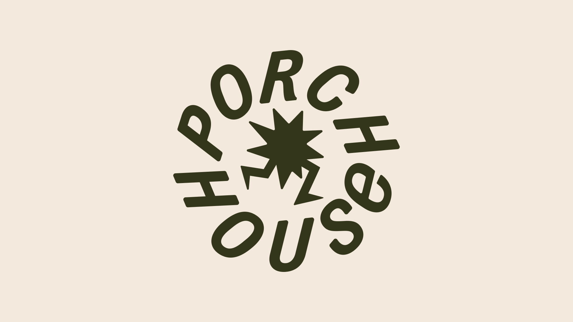
Porch House

The Problem
Porch House didn’t feel like their existing brand identity reflected who they really were. It blended in with their competition, who also chose to adopt a masculine, heavy, geometric look. Naturally, their main request was to nail a look to “stand out” from the crowd.
Well, in order to do that, we had to figure out who they’re standing next to. I conducted a competitive audit to see what was up.

Open Fields
We identified “open fields” — spaces in the category that aren’t clogged up by the competition. Then wrote positioning statements to try on for size.